I CREATED THIS BRAND as the sole design and marketing consultant for the startup. At the onset, I assisted the founders in selecting the name, Cocoa & Joe, along with guiding the client through defining a tone and strategy for their brand. I worked closely with the client to develop the wordmark, color palette, and typography system to reflect the client's vision for their drink stand. Design work is still ongoing and includes cup packaging, merch, stickers, uniforms, mural design, social media assets, signage, menus, and a website.
THE FUNKY COLOR PALETTE highlights the brand guideposts of being playful, down to earth, and welcoming. The mixture of complementary pastels with more vibrant, saturated hues establishes interesting contrast and playfulness in use.
Three business card variations allow employees to select their favorite color combination and composition.
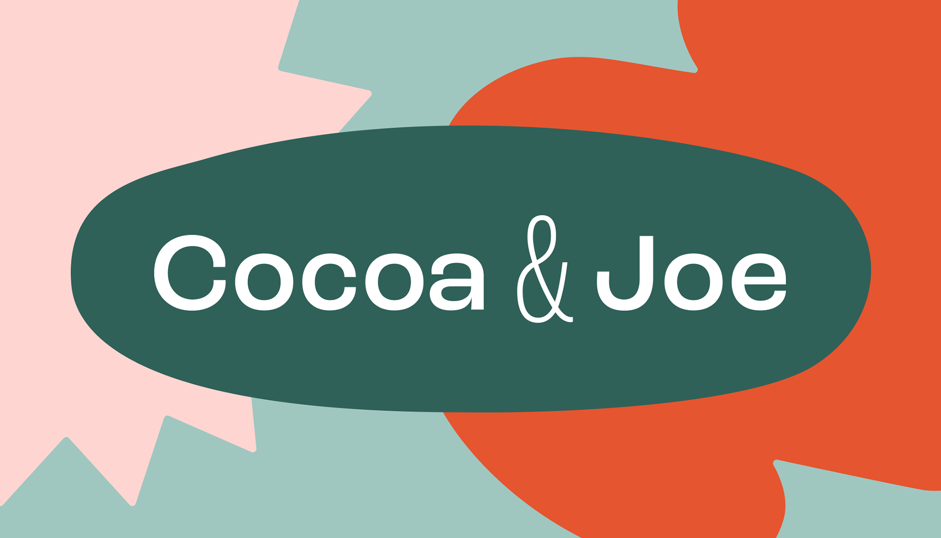
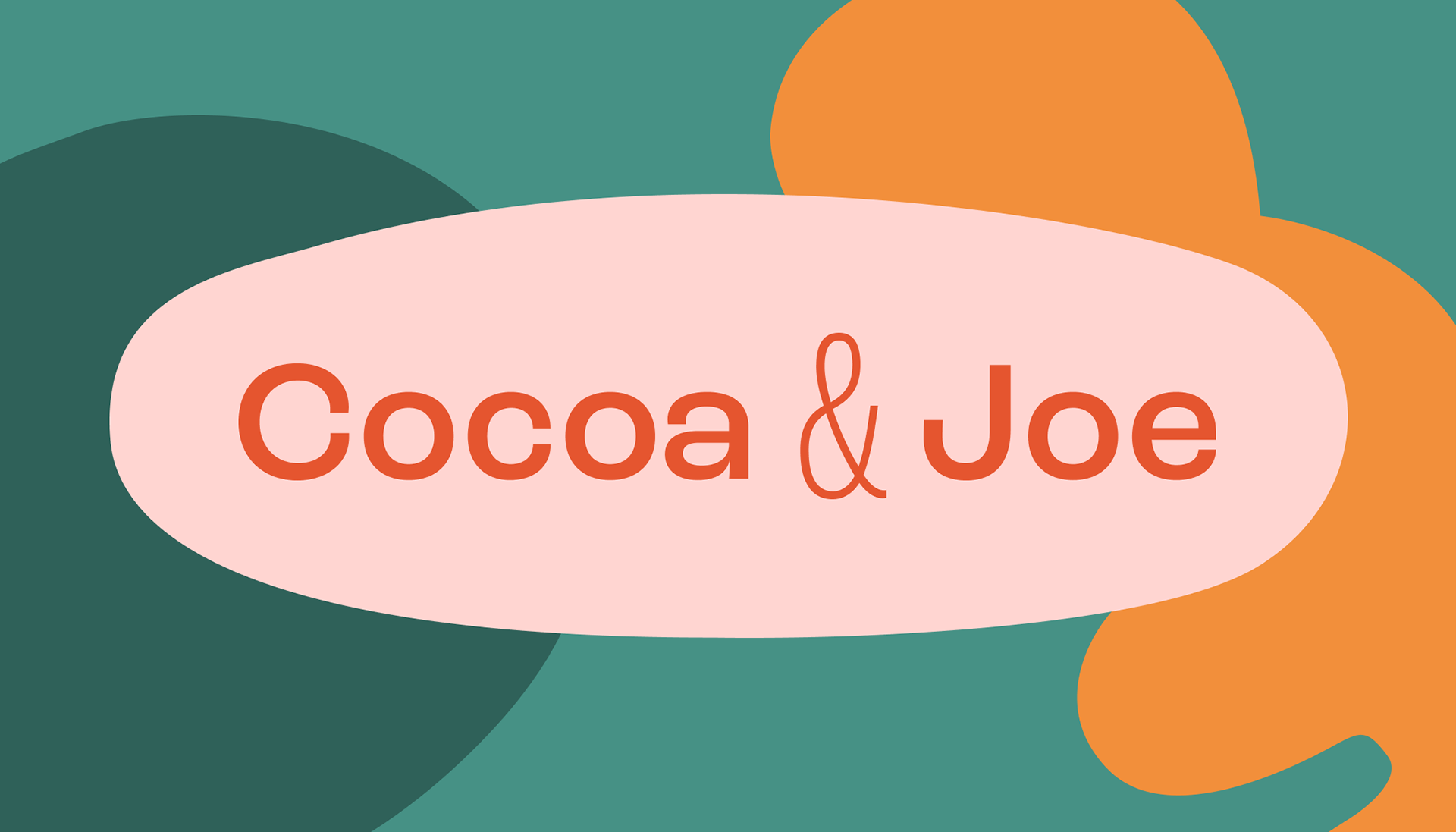
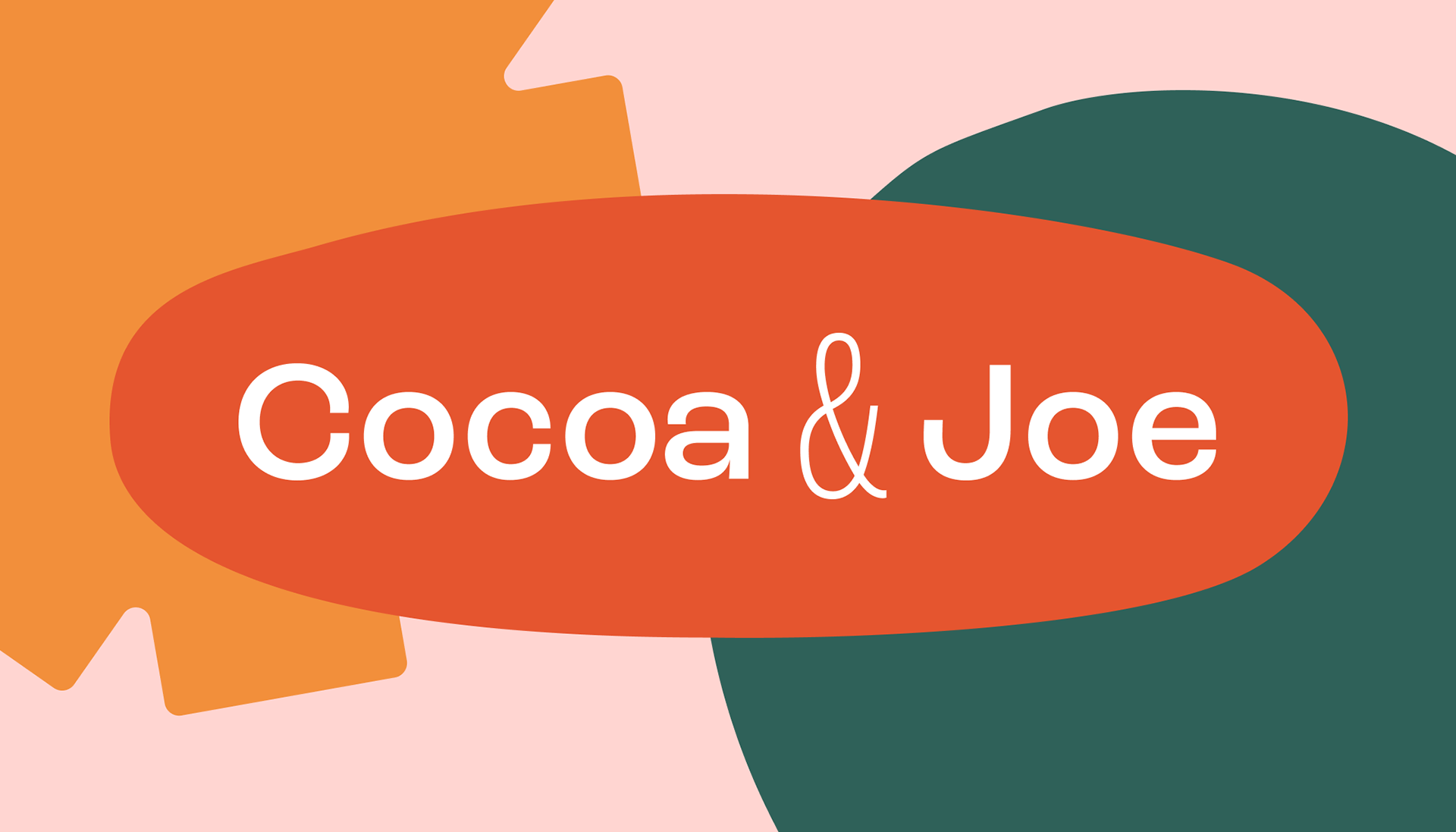
THE TYPOGRAPHY SYSTEM EXEMPLIFIES the playfulness of the brand while still feeling familiar and being easy to digest. Roc Grotesk lent itself well to the wordmark (Medium and Light Condensed styles were utilized), and it has proved to be a perfect typeface for creating the dynamic type system for future design work, like menus, signage, and other packaging. The simple, geometric letterforms are stunning by themselves, and they create dynamic compositions when paired with the bold colors in the palette and the funky shapes integral to the visual brand.
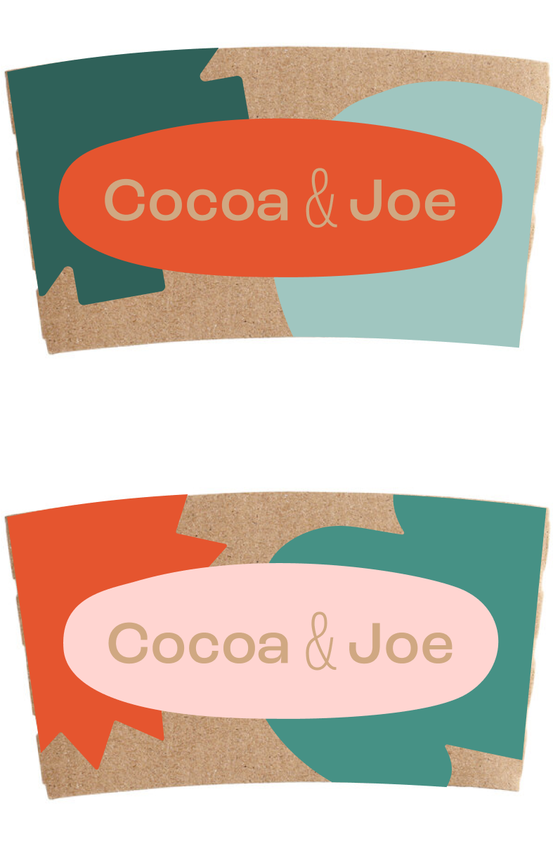
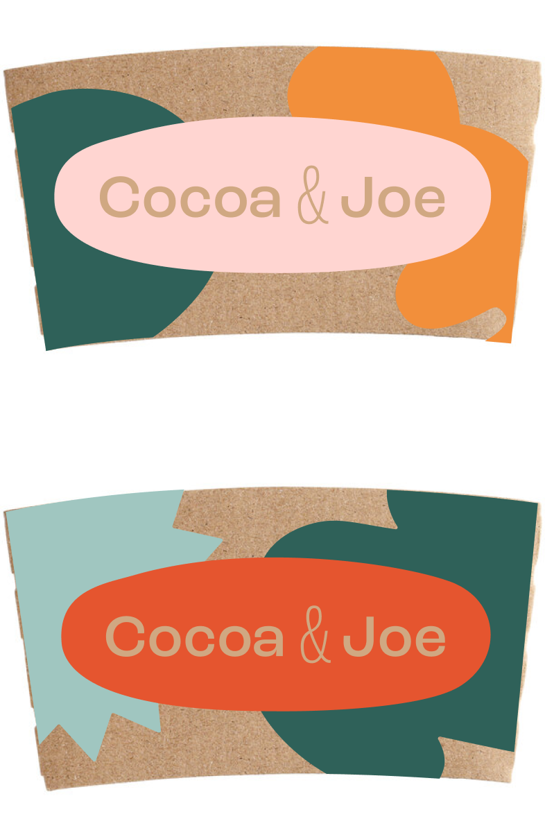
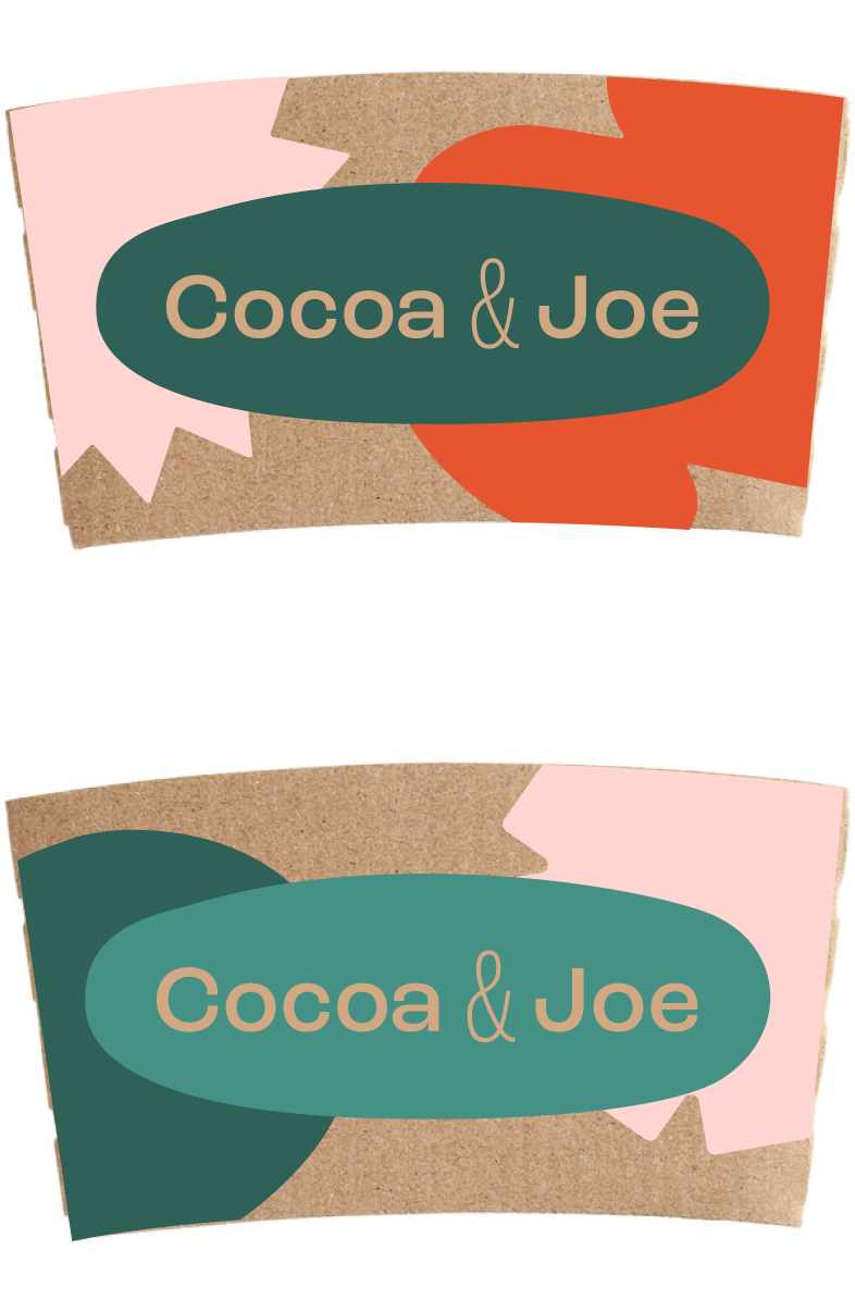
Drink sleeves for hot beverages.